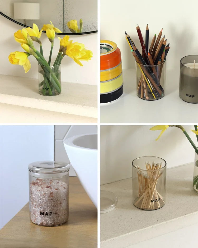
MAP Studio recently celebrated our first year. Looking back on what has been a journey of discovery and development where building a brand from scratch has thrown up no end of challenges. One of the things we’re repeatedly told by our wonderful customers who have supported us is ‘I love your branding and packaging’. With this in mind, we wanted to share a little insight into where the inspiration for our branding and colour palette came from.
It began on my customary summer break, visiting my husbands family in Feock, Cornwall. Upon which the family always set about planning daily trips to their favourite beaches, cove (or Porth in Cornish) and countryside walks that would always end with a cream tea surrounded by rolling hills.
On one such trip, a visit to the Barbara Hepworth Museum and Sculpture Garden in St Ives was on the morning agenda followed by some surf at Porthmeor beach (I watched whilst my boys, the cousins and dads would tumble around in the turquoise sea).
Visiting the Barbara Hepworth museum, it was the artists studio with the tools, aprons and raw materials where she had left them, that struck me with a melancholy beauty.
This photo led to our brand colour palette, with the earthy, washed out muted tones. I felt that it captured a rawness and natural tone that I wanted for the aromatherapy branding and packaging. The tactile feeling of the scultures on display in the studio and in the gardens was the other important facet to be included in our branding.

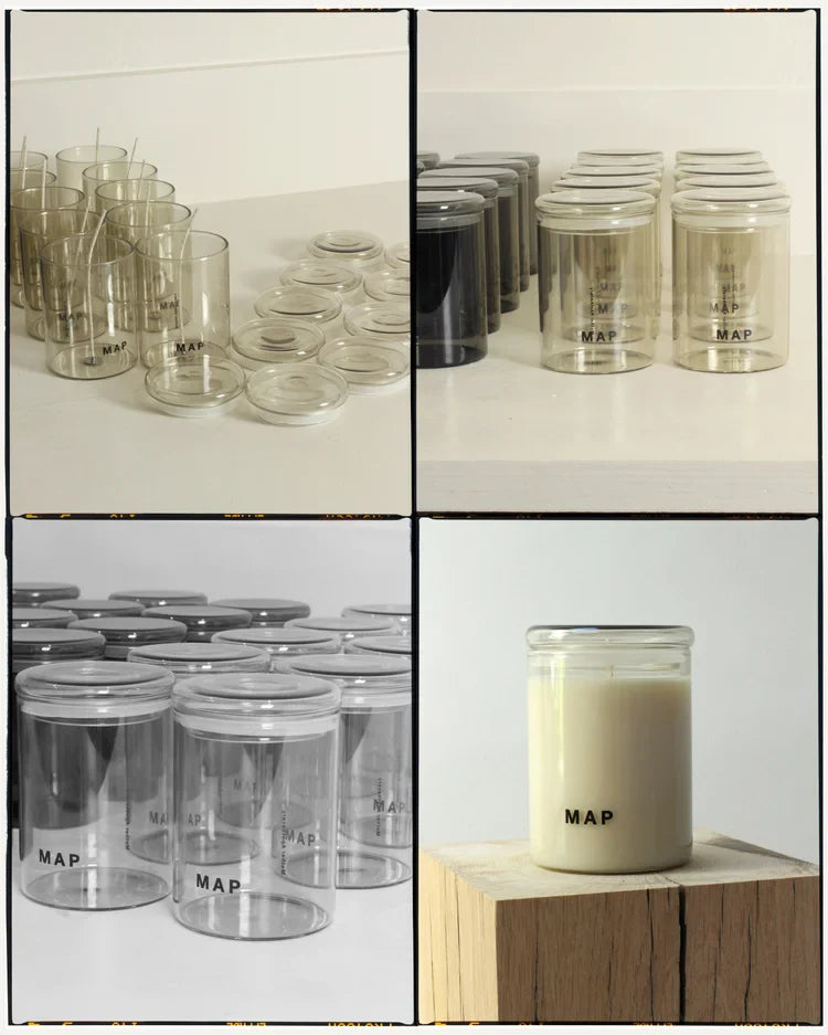
With the brand colour palette in place, the packaging a branding started to take shape. Our use of muted tones and a striped back approach to the branding reflects the beauty and simplicity of the natural materials used by Barbara Hepworth. No unnessesary patterns or design, to have a beauty in it’s simplicity, we wanted the product to speak for itself.


